Every new release is a fresh opportunity to present a piece of your story as an artist. How you package a single, EP, or album carries a lot of weight in cutting through the noise to strike the right emotional chord with your listeners.
Some successful artists treat an album drop like Apple releasing a new iPhone: developing and teasing out a visual campaign, targeting existing and new audiences, and coordinating a cross-platform launch.
A strong first visual impression of your release matters more than ever in today’s hyper-visual digital age. An enticing visual component can inspire a potential fan to listen rather than scrolling to the next thing.
In part one of this series, learn how to market your next release — specifically the key visual components which you can adjust according to your needs, comfort level, and resources.
Start Visualizing
An artform all on its own, crafting the right visuals for a release is all about sticking to who you are. Whether it’s imagery, illustration, video, or other forms of media, tailor it to your own identity as an artist.
Figuring out a visual accompaniment can be intimidating—especially for your first release. Don’t let this process hinder the most important thing: getting your music out.
Lean into what you’re good at, find photos from your camera roll, or reach out to creatives within your circles. Don’t be afraid to get in touch with those whose work you admire or think aligns with your own perspective.
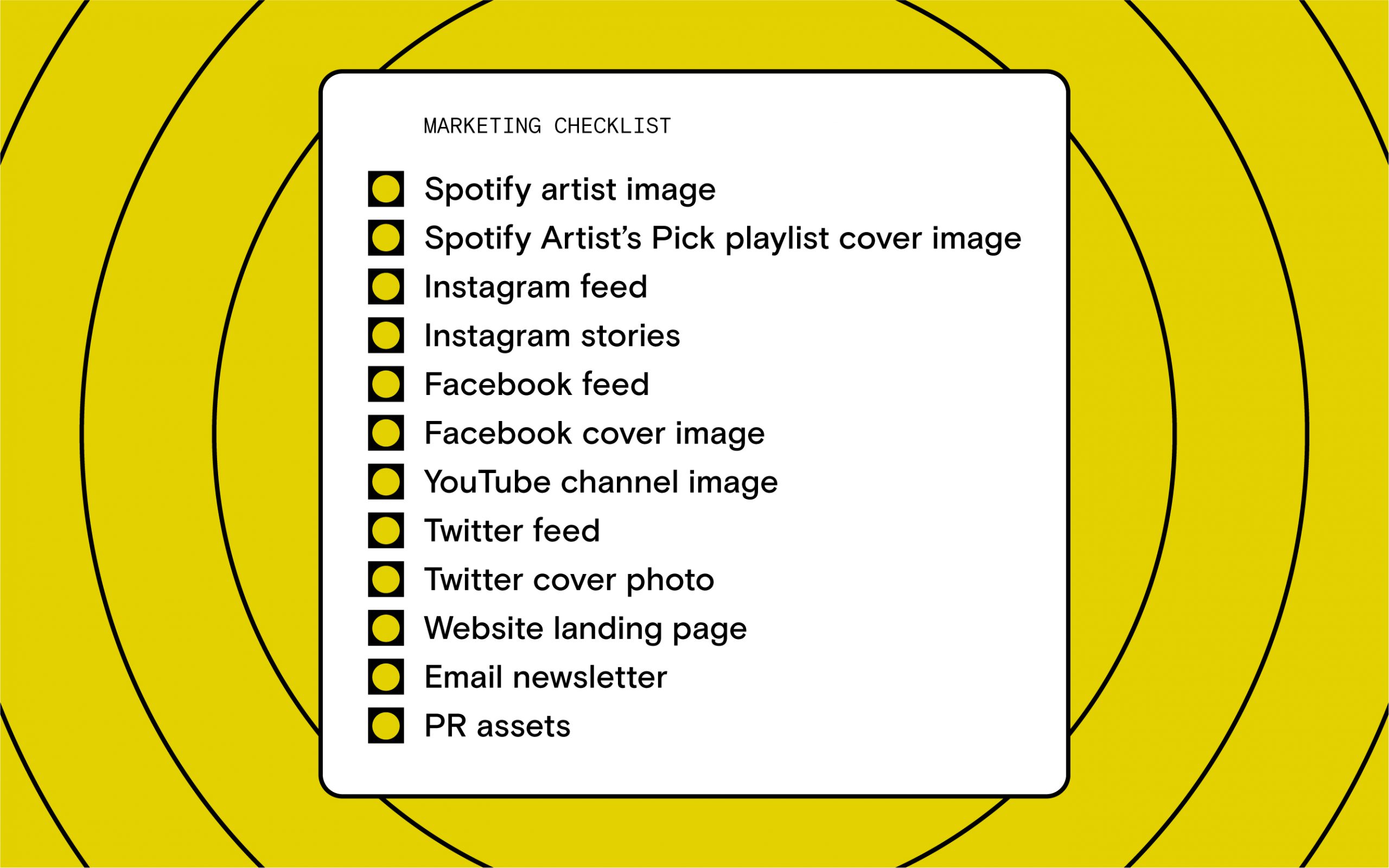
If you find yourself going at it alone, try to keep it simple and efficient. Find your billboards (social, email and streaming profiles, website, etc.) and create one touchstone concept that can easily be reinterpreted across all platforms. For example, this can be a photograph of your studio, a self-portrait, an illustration by your roommate.
Whatever you choose, consider how flexible the concept is. A good concept is one that can also be applied to your next one, two, or five releases. All of these assets can come from one visual, but having flexibility and variety lets you stretch out your promo for longer without wearing out the source material.
Case Study
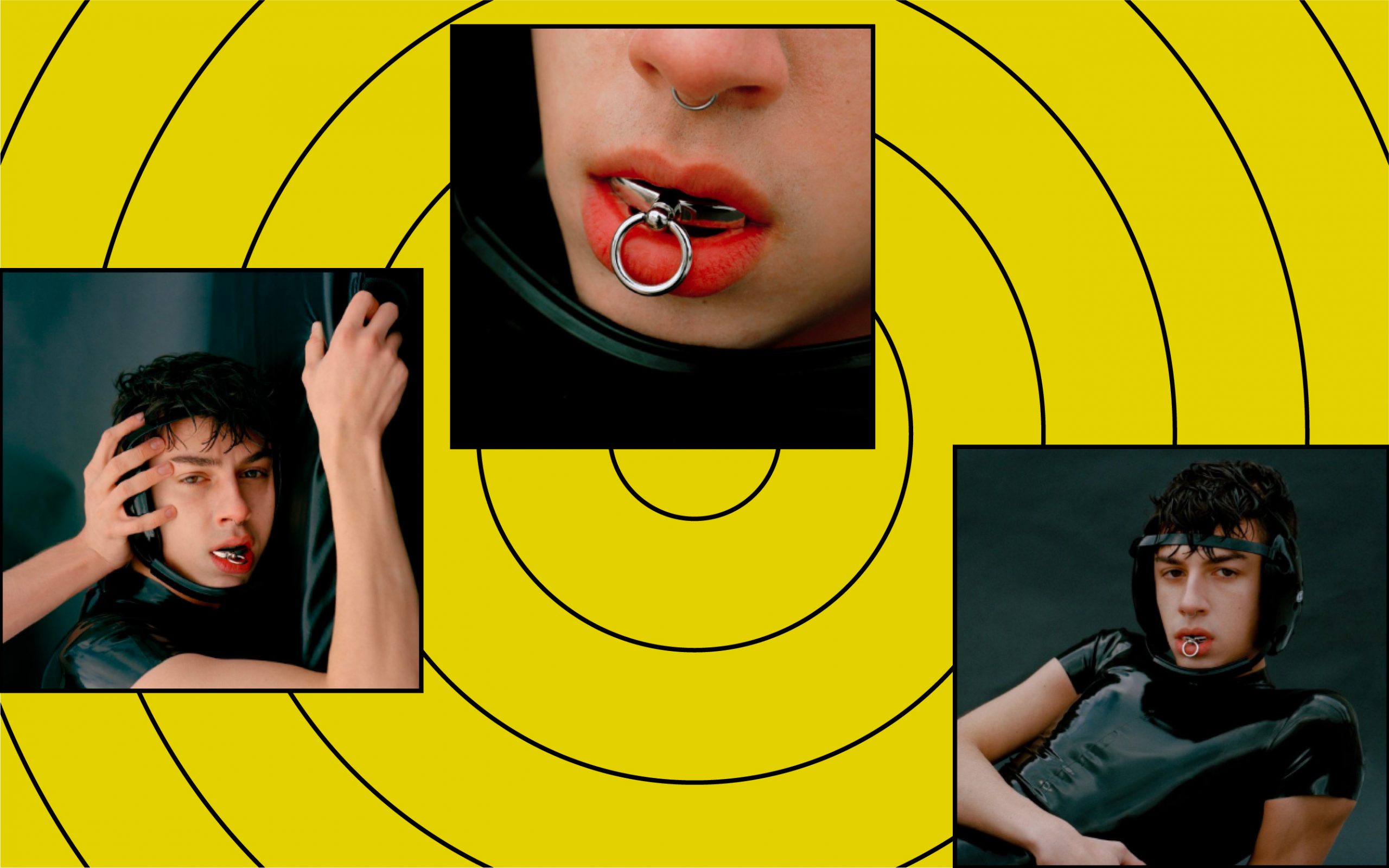
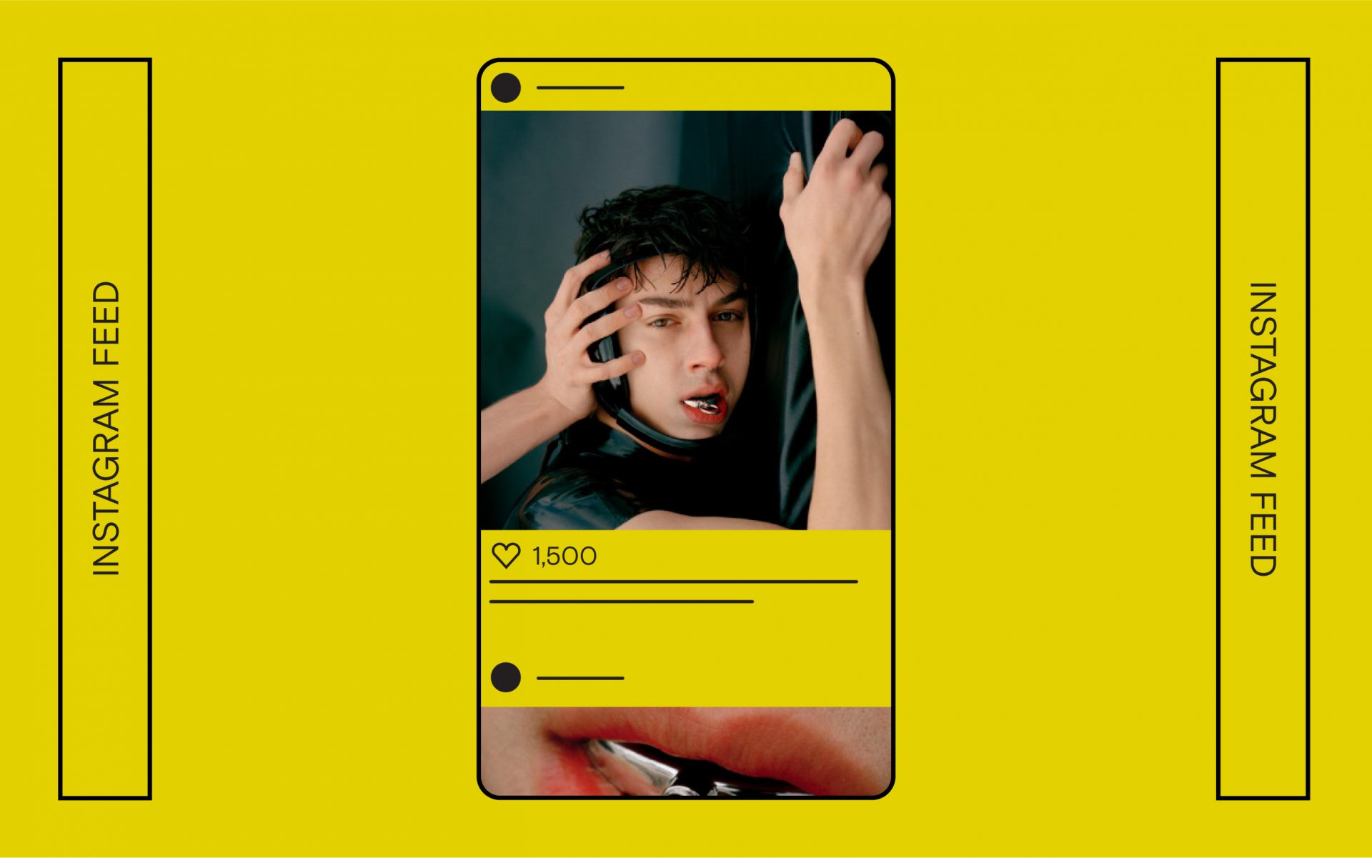
Let’s look at the creative for Justin Johnes’ latest single release, “Athlete.” In 2014, Johnes, then just 15 years old, competed on The Voice. Entering the spotlight at a young age, his evolution as a pop artist was more public than most others. Last year, when he began putting out music, Johnes wanted the accompanying visuals to exude a maturity synonymous with a queer coming-of-age.
“I wanted the visuals of “Athlete” to be about the power struggle that I allude to throughout the song,” Johnes shares.
“It’s so common for me to feel as though I lack power in relationships, but I’m also not comfortable when I hold any sense of power or control. We were really excited about the idea of using pseudo-sportswear to further convey this theme of power through vulnerability.”
Shot in kind by his friend Ryker Allen, Johnes was photographed with relevant props and accessories to realize his concept and musical message.
“The mouthguard I’m wearing is made by Bond Hardware, and the singlet is actually made of latex, instead of the usual spandex,” he says. “I guess these elements imply a level of sexuality but for me, it’s more about the toughness of rubber and metal and the fact that none of the things I’m wearing are actual pieces of wrestling gear.”
A Quick Guide on Profile Dimensions
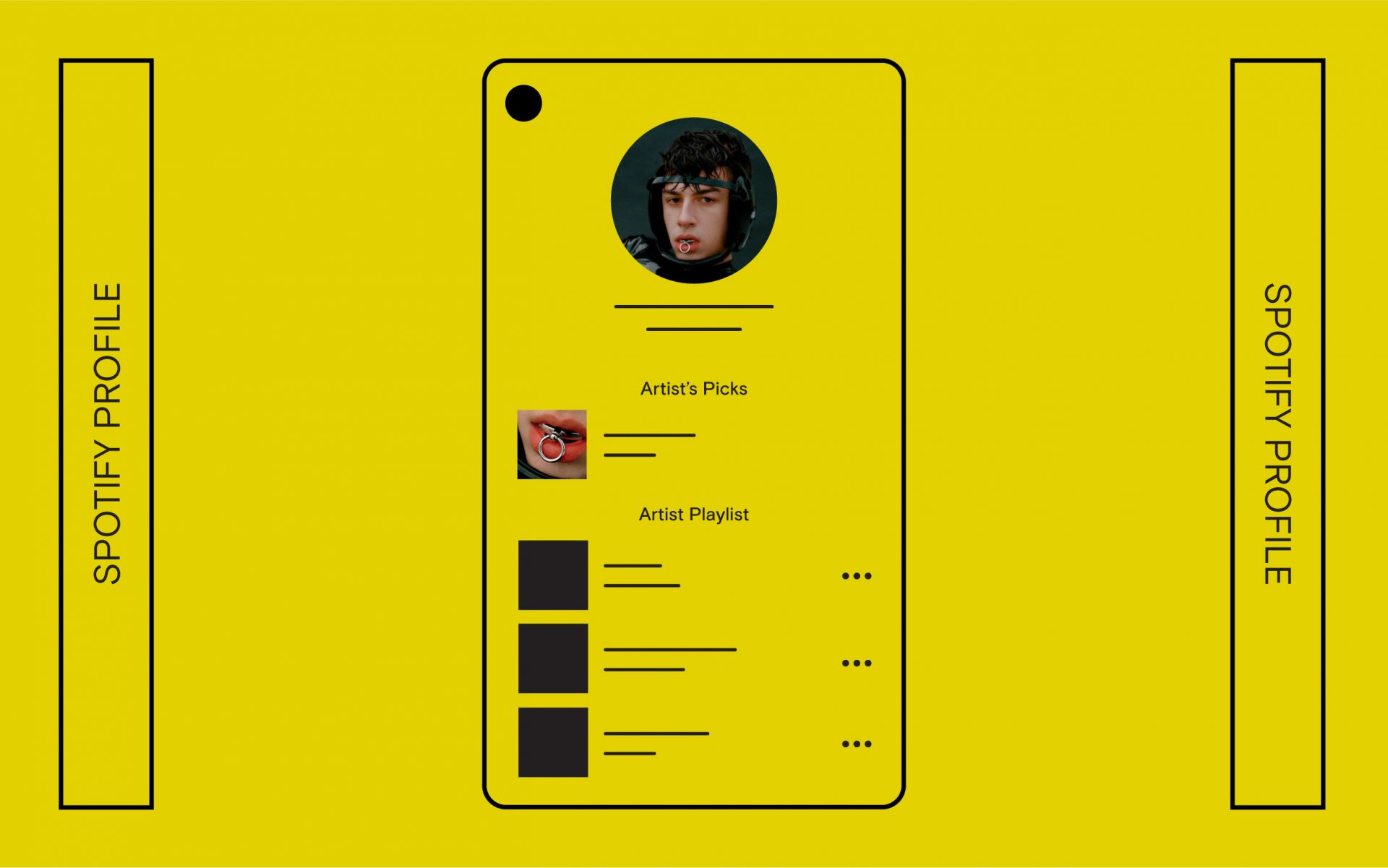
Spotify artist image dimensions: (2660 x 1140px)
Instagram square dimensions: 1:1 (1080 x 1080px)
Instagram landscape dimensions: 1.91:1 (1080 x 608px)
Instagram portrait dimensions: 4:5 (1080 x 1350px)
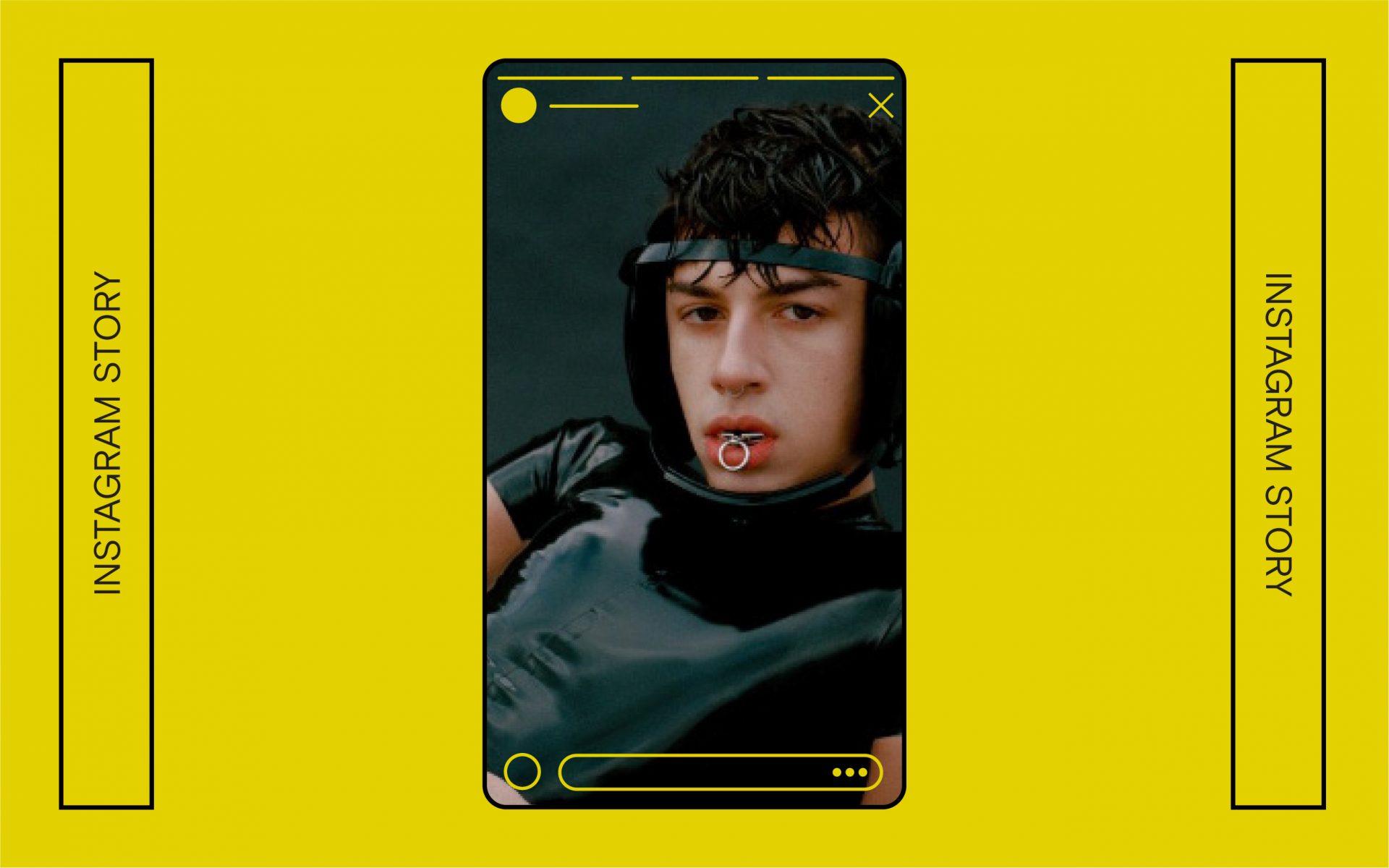
Instagram Story dimensions: 9:16 (1080 x 1920px) or 1.91:1 (1080 x 608px)
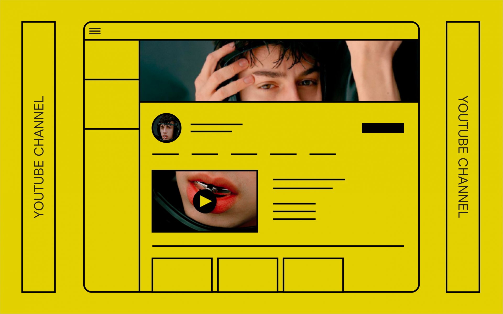
YouTube banner dimensions: (2560 x 1440px)
YouTube profile dimensions: (800 x 800px)
YouTube thumbnail dimensions: 16:9 (1280 x 750px)
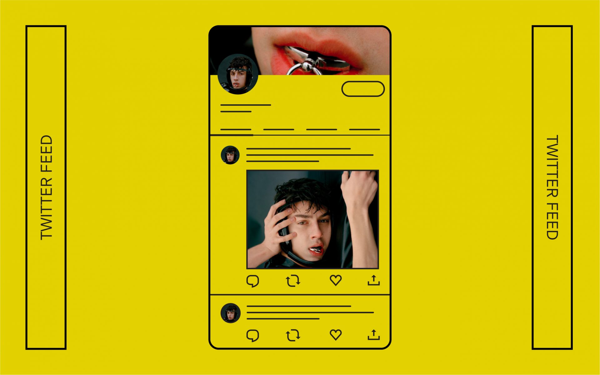
Twitter banner dimensions: (1500 x 500px)
Twitter profile dimensions: (400 x 400px)
Twitter image dimensions: 2:1 (440 x 220px)
Johnes posted just three images across his channels to support his new sound. Allen, among Johnes’ other friends, also shared the artwork on their socials, exposing new potential listeners through the most powerful marketing tool — word of mouth.
Working with fellow creatives has its advantages — many independent artists can empathize with your desire to create and find an audience for your work. And oftentimes, they’re also looking to collaborate on projects that they find more engaging or challenging than their regular gigs. The invaluable sense of trust from working among friends can help determine the final product, too.
“Ryker and I workshopped the idea of portraying me as a wrestler, losing the fight,” Johnes explains. “Since we’re so close, I felt very comfortable being vulnerable in front of them. I guess the photos wouldn’t feel so honest if I didn’t trust the person behind the camera.”
The production of your visual elements should be scalable and within means.
“We shot the photos on the rooftop of my apartment building,” Johnes says. “ It was a small production that took less than an hour. Since I make and record all of my music in my bedroom, I felt very used to the environment of working in such a familiar place. I really love how the song and visuals were all made in the same place; it really unifies the whole project.”
The Less Obvious
A post with an image performs better on Twitter or Facebook than without — videos or GIFs are better still. Facebook ads with videos receive 20% more clicks than ones with still images. Even image orientation is important: Portrait images take up more space on screen but perform better than landscape shots.
Consider pushing your visuals further with motion. Find a friend who’s able to help you with a program like Adobe After Effects ($21 USD/month) or watch tutorials on YouTube to learn how to tackle it yourself. Alternatives to Adobe After Effects include Apple’s Motion ($50 USD), Blender (free), Natron (free), or even PowerPoint!
And since content in the digital age is so multidimensional, your bank of visuals can come from just your phone’s camera roll. A behind-the-scenes video of the shoot, a selfie from the studio, or a scan of some lyrics require little-to-no overhead but add depth to your release.
It may seem daunting but starting is the first step. Take an afternoon to go through your own photos, jot down a list of your creative friends, and create a mood board of ideas. Stay true to your message and you’ll find a visual concept along the way.
Nate Cover is the Founder and Creative Director of Babyface, a design and content studio building experiences for URL and IRL. He’s worked with brands including Nike, sweetgreen, Hello Mr., Away, Thinx, and the National Geographic Channel, but mostly he’s just hell-bent on improving queer representation in the creative industries.
Interested in writing for Level? ↳